In this article, I introduce a new and useful tool for practitioners of digital color called the Color Navigation Map (CNM). Inspired by geographical maps, the CNM displays a perceptually-uniform and -complete subset of the RGB color gamut in a single image, with colors arranged continuously, consistently, and intuitively. It provides persistent awareness of position within color space, so that it can be navigated, learned, and utilized more effectively.

Color Navigation Map (CNM): ~67,000 perceptually-uniform and -complete colors, spanning the full RGB gamut
The CNM samples the full RGB color gamut polyhedron in Lab space with a perceptually uniform discretization of 2.3 ΔE or 1.0 JND (just noticeable differences). It uses CIELCh hue, saturation, and value to map colors within the intuitive spherical system of meridians, hemispheres, and parallels. The singularity at pure black is exploited to bifurcate the gamut into two continuous and equal hemispherical subsets of "high" and "low" saturation, by scaling the gamut polyhedron along its "a" and "b" axes. This approach enables 1-bit encoding of saturation as hemisphere, and continuous encoding of hue and value as azimuth and elevation. A continuous spline histogram equalization algorithm is used to evenly distribute hues between the full range of azimuth angles. The equal-area Equal Earth map projection is used to flatten the spherical coordinate system into 2D, and a Voronoi diagram is used to convert the sparse points to a dense image. The CNM has constant hue along meridians, constant value along parallels, similar saturation in each hemisphere, and roughly equal representation for all hues.

CNM annotated with key features
Dimensionality and Lessons from Mapmaking
Fundamentally, digital color is 3D. Whether described in RGB, HSV, XYZ, Lab, or any number of other color spaces, all colors are defined by a unique triad of independent values. Meanwhile, screens are 2D. This inherent rank mismatch leads to significant awkwardness in working with digital color. Selecting a color is akin to leafing through a whole book to find a specific illustration, instead of simply picking it out from many illustrations hanging in gallery. Disorientation in color space is therefore very natural, and a key challenge to using color effectively.
Technically speaking, the task of continuously arranging all colors in 2D, with no gaps or exclusions, is not possible. However, mapmaking has shown that technical limitations need not preclude practical solutions: Earth's surface cannot be fully represented in 2D, yet map projections have successfully facilitated navigation for centuries. In terms of rank, color is more complex even than cartography — whereas an azimuth/elevation pair corresponds to a single value like altitude on a globe, in LCh space, any pair of properties corresponds to multiple values. This is like the difference between a solid spherical ball, and a hollow spherical shell.
Images Containing All Colors, and Their Limitations
This project originated from Bruce Lindbloom's "An RGB Image Containing All Possible Colors", which takes the RGB B value like a "page" index and creates 256 sub-images for each possible value.

Bruce Lindbloom's "An RGB Image Containing All Possible Colors"

Rows sorted by Lab hue, columns sorted by RGB B value

Rows sorted by HSV saturation, columns sorted by Lab hue
Although some macroscopic order exists, images created this way are plagued by high-frequency noise which at best creates the illusion of continuity, as if by dithering.
A more recent open-ended competition called "Images With All Colors" challenged coders to best arrange all RGB colors as single pixels as they saw fit, producing a number of interesting results:

"Rainbow Smoke" by József Fejes

"Tileable diamonds"
There is actually a website devoted specifically to this challenge, allRGB.com, showing a number of different approaches and results.

allRGB.com, a website devoted to images containing all colors
However, due to inherent limitations, no image produced under these constraints has continuous, consistent, and intuitive placement of color.
All mapmaking involves compromises and balancing competing priorities, and the "color mapping" problem is no different. After much of trial and error, I eventually developed a method that produces a result that is well-balanced in terms of my "continuous, consistent, and intuitive" guiding principles. To clarify these:
- Continuous: adjacent colors have minimal color difference
- Consistent: all colors are treated the same; strong alignment between colors with matching color properties
- Intuitive: color positions can be predicted from color properties, and vice versa; map is simple and requires minimal explanation
Method Summary
Generate a uniform RGB color gamut. Only the boundary is of interest, so a resolution of about 25 values per channel, or 25^3 = ~15,000 total colors, is sufficient for convergence.
Calculate the polyhedral boundary of the RGB color gamut in Lab space. Note that the boundary is slightly concave, so a convex hull algorithm will provide slightly inaccurate results. MATLAB's built in boundary.m works well for this, provided that a non-zero shrink factor is used to account for the slight concavity.
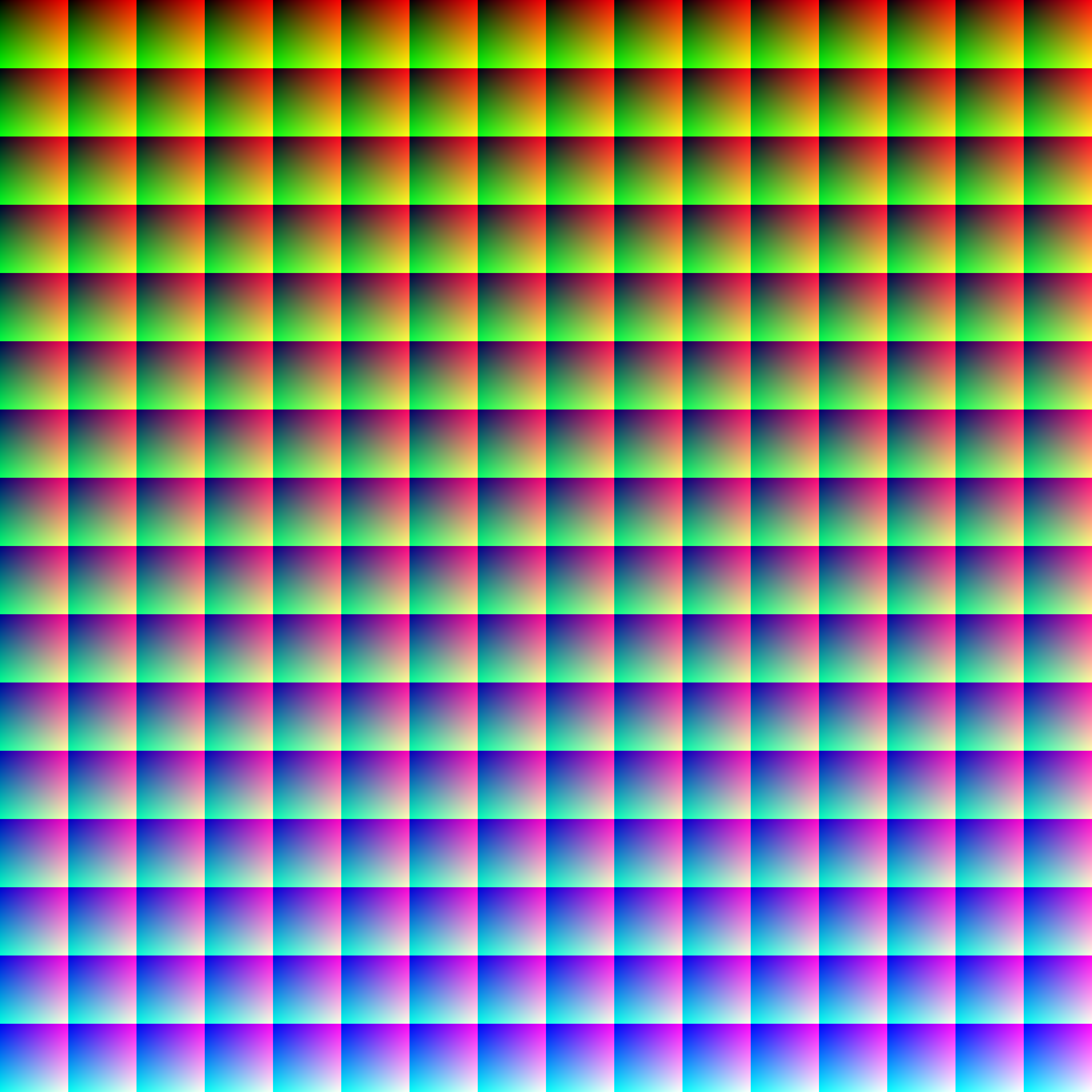
Uniformly sample the volume inside the polyhedron using a fixed ΔE of 2.3 in L, a, and b. I use inpolyhedron.m for this purpose. In the figures below, I show ΔE = 10 for the sake of illustration. The ΔE value of 2.3 corresponds to one "just noticeable difference" or JND, a reasonably fine discretization of the continuous Lab space. Finer or coarser values of ΔE can be used as needed.

Perceptually uniform colors sampled at ΔE = 10 inside the RGB polyhedron in Lab space

View of ab plane for uniformly sampled colors

Perceptually uniform colors sampled at ΔE = 10 in RGB space
Linearly map LCh hue to azimuth angle, and LCh value to elevation.
Fit a monotonically increasing spline to the cumulative distribution function (CDF) of azimuth (hue) angle for continuous histogram equalization, resulting in a roughly even probability density function (PDF). This compensates for the significantly non-uniform distribution of hues within the gamut polyhedron.

Continuous spline histogram equalization of azimuth (LCh hue)

Top view of colors before (left) and after (right) azimuthal histogram equalization
Scale the gamut polyhedron by 69% about the a and b axes to partition the gamut into two hemispherical subsets of roughly equal volume and color quantity. Colors outside the scaled polyhedron are assigned to the upper hemisphere; inside to lower. Applying no scaling to L maintains the common black/white singularities, such that both sub-gamuts converge to the same color at extreme high and low values, a necessary condition for inter-hemispherical/equatorial continuity.

Scaled polyhedron boundary for bifurcation of color gamut into hemispheres
Invert elevation for the inner sub-gamut, i.e. allocate the less-saturated colors to the lower hemisphere.

Colors mapped to unit spherical surface by LCh hue, saturation, and value
Use the Equal Earth map projection to flatten the spherical coordinate system into 2D. The choice of Equal Earth among other map projections was motivated by its equal-area constraint, symmetry, minimal distortion, illustrative shape, and ease of implementation.


Map projection of colors on spherical surface to flat plane
Create a Voronoi diagram for the map projection; fill cells using the closest color.
Overlay parallel and meridian lines as desired. Set area outside of map projection as transparent.
Properties of the CNM
By design, the CNM has several useful properties intended to make it as continuous, consistent, and intuitive as possible:
- Meridians (vertical lines of constant azimuth/latitude) have constant LCh hue
- Parallels (horizontal lines of constant elevation/longitude) have constant LCh value
- Hemispheres have similar LCh saturation
- LCh hues have roughly equal representation


Histogram equalization is deliberately not applied to the output CNM image, as the gamut polyhedron is itself not R/G/B balanced due to the perceptual non-uniformity of RGB space. As a consequence of the geometric mapping strategy, the CNM does not have equal area for each color contained, although the degree of non-uniformity is mitigated significantly by the use of azimuthal histogram equation and an equal-area map projection. Equality of area per color may be improved in future iterations, but probably cannot be solved completely without breaking more important CNM constraints.
Because the CNM does not strictly contain all RGB colors, positioning oneself within it must be done by color difference minimization, rather than exact matching. Because an Lab discretization level of 2.3 ΔE or 1.0 JND was used, any arbitrary input color (e.g. from a photo) can be matched to within 1.0 JND of a point/color within the CNM.
In this demo, I select colors from a photo randomly, and they are matched and positioned on the CNM, providing persistent awareness of position within color space. Here I'm using CIE76 color difference for speed, but CIE94 or CIEDE2000 could be used for better accuracy on faster hardware and/or software.
Note that the GIF format used here for convenience is limited in terms of color depth, so some compression artifacts occur. Also, I've sped up the GIF for the sake of illustration.

Demo of matching photo colors against the CNM
The CNM can also serve as a perceptually complete and persistent palette of colors from which a user can freely select.

Demo of picking colors from the CNM

Conventional color picking in GIMP
To get to any single color in GIMP, you must first adjust a hue slider, then pick an x, y point to define saturation and value. At any single moment in time, you can only see a single hue. Although the conventional approach offers much finer color resolution, it's much less intuitive, not persistent, and does not capture the highly relativistic aspect of color. Picking colors effectively requires awareness not just of the single color at hand, but also how it fits and interacts with all other colors in its scene. This aspect is simply missing from the conventional approach.
In a broader sense, as the name suggests, the CNM is designed for navigation; in other words, to be used as a compositional aid for painters, illustrators, designers, etc., who are interested in planning how their work will use the available gamut of colors and the associated relativistic effects to convey their ideas most effectively. This is analogous to how early explorers used geographical maps to plan their routes according to both the terrain and their goals.
I expect that other uses for the CNM may present themselves over time.
Other Variants
Up to this point, I've been describing what I consider to be the "default" parameters of the CNM, best tailored for my personal use, but many are adjustable. In this section, I'll show some variants to motivate other uses.

ΔE = 2.3, ~67,000 colors, white equator
Here the value mapping is inverted, so that the equator is white and the poles are black. I decided against this configuration as the RGB gamut is significantly fuller around black than white, resulting in fewer equatorial gaps. Still, this configuration might be preferable in some cases.

ΔE = 10.0, ~800 colors
I also see utility in a full-domain yet low-resolution CNM. Here I've drawn the Voronoi boundaries in black to further accentuate the low resolution and coarse cell boundaries. It's much easier to choose between hundreds of colors instead of millions; in many cases the full resolution is not helpful, or even a hindrance.

ΔE = 2.3, ~67,000 colors, meridians every 45° and parallels every 22.5°
Lines of constant elevation and/or latitude can also be overlaid to convey contours of constant property and suggest the shape and distortion of the map projection.
Source Code
Coming soon to my GitHub.
No comments:
Post a Comment